The Phantom of The Opera
For this project, I set out to design a cohesive book cover and poster that captured the dark, dramatic essence of The Phantom of the Opera. Drawing inspiration from mood boards that reflected the story’s themes, I noticed a common use of red and black color schemes, striking contrasts, and a central figure as the focal point. I also explored symbolic elements that represent the story’s core themes, such as the rose, mask, and music. My goal was to convey the Phantom’s mystery, Christine’s beauty, and the strong musical presence within the narrative while ensuring that both the book cover and poster worked harmoniously together.
the problem
The challenge for this project was designing a cohesive book cover and poster that complemented each other while effectively capturing the theme and storyline of The Phantom of the Opera. My goal was to convey the Phantom’s mystery and Christine’s beauty, as well as to incorporate the story’s rich musical elements in a visually compelling way.
Moodboards
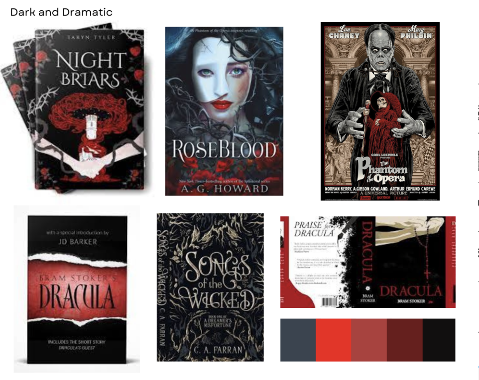
I explored mood boards that aligned with the dark and dramatic themes of The Phantom of the Opera. Many of these featured red and black covers with striking contrasts, often highlighting a central figure as the focal point.
I also selected imagery that best represents the connection between Christine and the Phantom, along with the overarching themes of the story. The rose, mask, music, and the color red stood out as the most symbolic elements, effectively capturing the essence of the narrative.
sketches
These sketches were inspired by the mood board and key events from The Phantom of the Opera, particularly the dynamic between Erik and Christine, the fire, and the Phantom shattering the mirror that reflects his face. I also incorporated elements from the story, including the rose, mask, music, and the color red, as they best represent the story’s themes.
The challenge
The most challenging aspect of this design was integrating all the individual elements into a cohesive digital composition while also creating each component from scratch. The process of designing the book covers alone was incredibly time-consuming, not to mention refining details such as the color scheme, typography, wording, and title styles. However, laying out all these elements allowed me to better assess what needed adjustments or replacements, ultimately strengthening the final design.


