casa costa
bakeshop
For years, Casa Costa Bakeshop has been my go-to spot for working on designs, enjoying their warm atmosphere and delicious treats. Run by a family with Brazilian and Portuguese heritage, their culture is beautifully reflected in their baked goods, drinks, and overall vibe. Inspired by their rich roots, I set out to reimagine their brand identity in a way that truly honors and celebrates their unique story.
The Problem
Casa Costa’s original logo didn’t fully capture the essence of its Brazilian and Portuguese heritage. With its swirled design and distressed lettering, the aesthetic leaned more toward a Western style rather than reflecting the warmth and vibrancy of the culture.
DISCOVERY
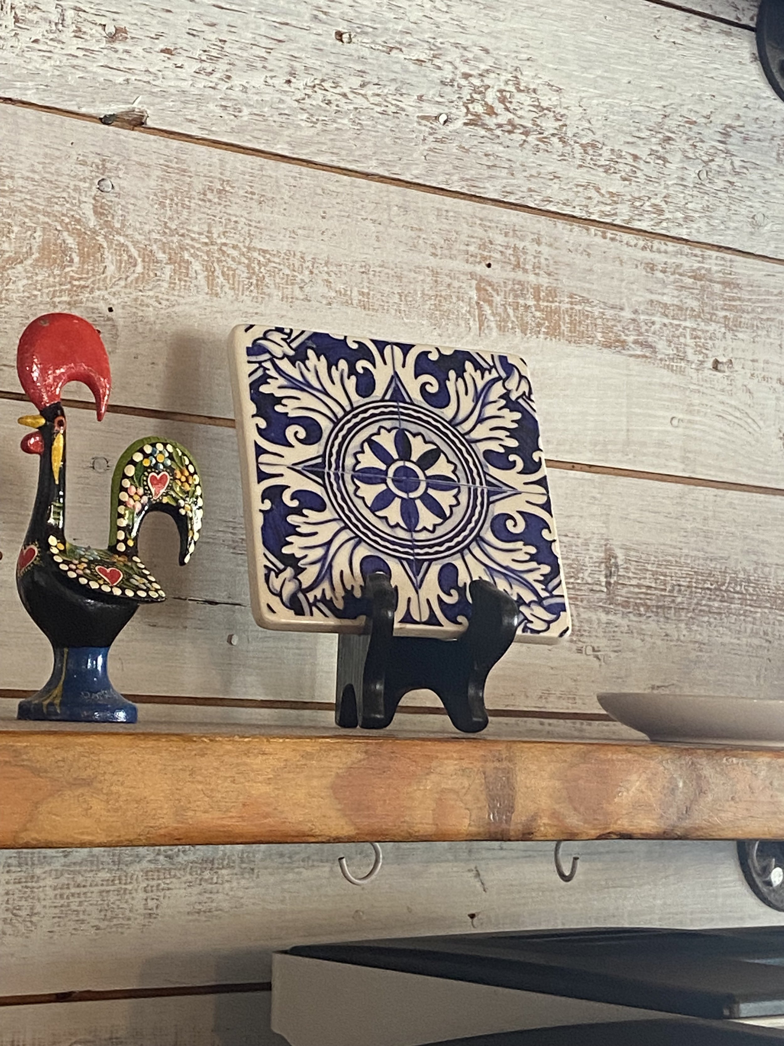
I drew inspiration from the intricate tilework found in Portuguese and Brazilian design, known for its rich details and craftsmanship. Some of these tiles even featured lettering that echoed the Casa Costa logo. The deep blues commonly seen in these tiles, along with the signature blue used in the shop, also played a key role in shaping the rebrand’s visual direction.
Sketches
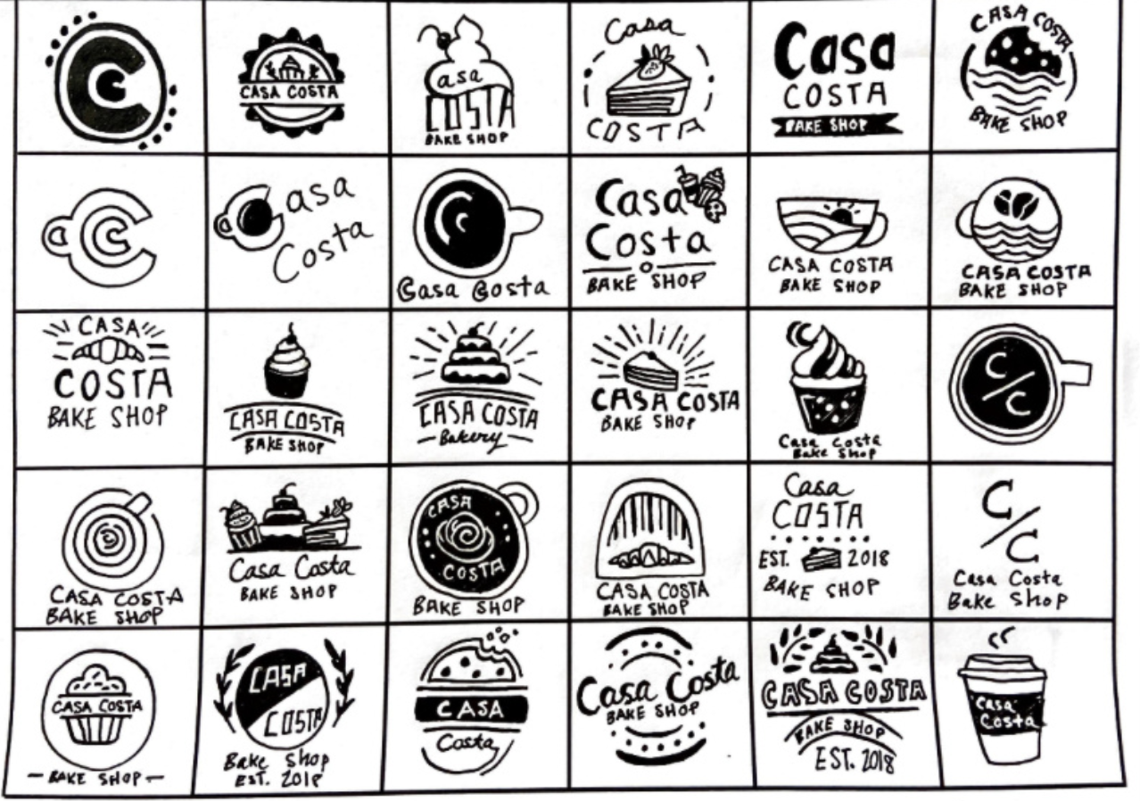
Inspired by the tiles, pastries, and geography of Brazil and Portugal, I made my initial sketches to reflect the uniqueness of Casa Costa Bake Shop.
Challenge
The challenge of rebranding Casa Costa was finding the perfect balance between refreshing the original logo while staying true to its Brazilian and Portuguese heritage. Since the shop is known for both its delicious pastries and drinks, I wanted the new branding to reflect that as well. I designed a simple yet meaningful logo that draws inspiration from the colors, typography, and intricate tilework found in the shop and its cultural roots. Each packaging element—coffee bags, cups, and pastry boxes—features its own unique tile-inspired icon, creating a cohesive and authentic visual identity. To tie everything together, I kept the color palette rooted in shades of blue, white, and yellow, reflecting both the shop’s interior and its cultural influences.
Mockups
REFLECTION
Rebranding Casa Costa Bakeshop was an exciting challenge that allowed me to merge cultural storytelling with thoughtful design. Having spent years working on my designs in this cozy, family-run shop, I felt a deep appreciation for its warmth and heritage. The owners' Brazilian and Portuguese roots are beautifully reflected in their baked goods, drinks, and hospitality, but their original logo didn’t fully capture that essence. With its swirled design and distressed lettering, the previous branding leaned more toward a Western aesthetic rather than representing the vibrancy and tradition of their culture.
To create a more authentic identity, I turned to Portuguese and Brazilian iconography, specifically the intricate tilework often seen in these cultures. The detailed patterns, typography, and signature blue hues of these tiles became the foundation for the new brand identity. The shop itself already incorporated these design elements, making it a natural and seamless source of inspiration. Some of the tiles even featured lettering that resembled Casa Costa’s name, reinforcing the connection between tradition and branding.
The biggest challenge was finding a way to refresh the original logo while staying true to its roots. I wanted to ensure that the branding honored both the Portuguese and Brazilian influences while also highlighting Casa Costa’s dual identity as both a café and a bakery. The solution was a clean, tile-inspired logo that embodied the shop’s culture through its color, type, and intricate yet simple design. To further reinforce this theme, I designed unique tile icons for their coffee bags, cups, and pastry boxes, giving each packaging element its own identity while maintaining a cohesive look. The color palette—blues, whites, and yellows—tied everything together, reflecting both the shop’s interior and its cultural inspiration.
This project was more than just a visual update; it was an opportunity to celebrate the essence of Casa Costa and create a brand identity that truly reflects its heart and heritage. Through this process, I was reminded of the power of design in storytelling—how colors, typography, and patterns can connect people to a place, a culture, and a feeling of home.


